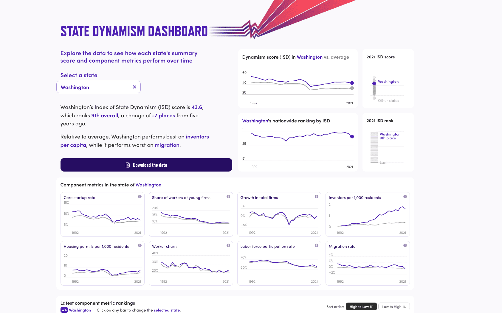
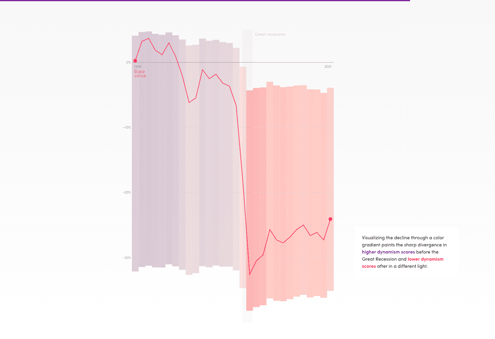
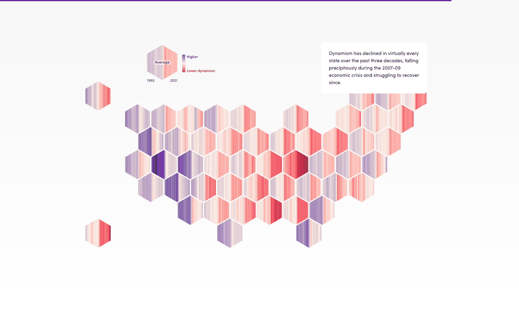
The Index of State Dynamism, a project I led at Voilà: Information Design, visualizes the Economic Innovation Group's research on U.S. economic dynamism since 2008. A scrollytelling piece and interactive dashboard all in one, it leads the reader through a guided narrative before inviting them to explore the data on their own. The star of the show is a hex map displaying 1,400 data points over 30 years, with a style that echoes the famous climate change warming stripes.
The smooth, scroll-bound animations link together the different charts and ideas, but readers with motion-sensitivity or using screen-reader support can also opt for a static version.
The team behind this included Celia Albano for the visual identity, Julian Hernandez and myself on the concept and information design, and Francis Gagnon on supervision. I worked on the code to translate the vision into reality. Development was done in Svelte, with extensive use of the D3.js colour interpolator, LayerCake, and U.S. hexagon shapes from Tilegrams.
This project was shortlisted at the Information is Beautiful Awards.