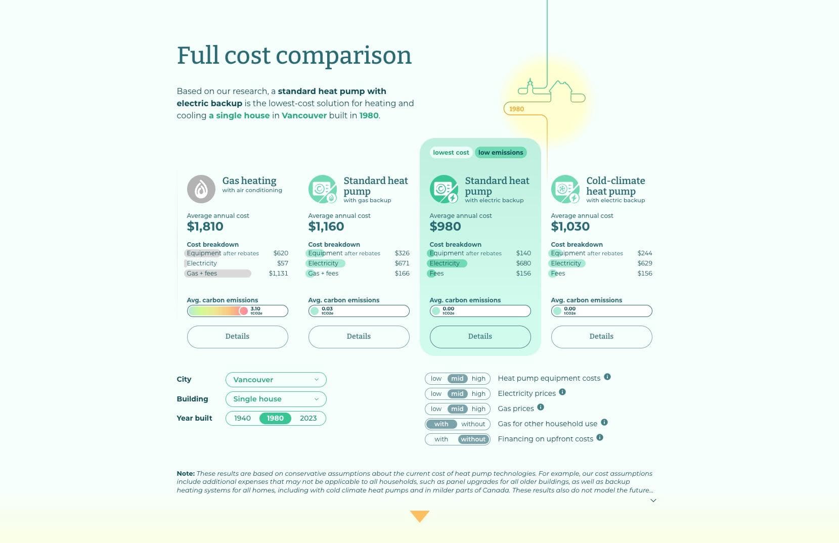
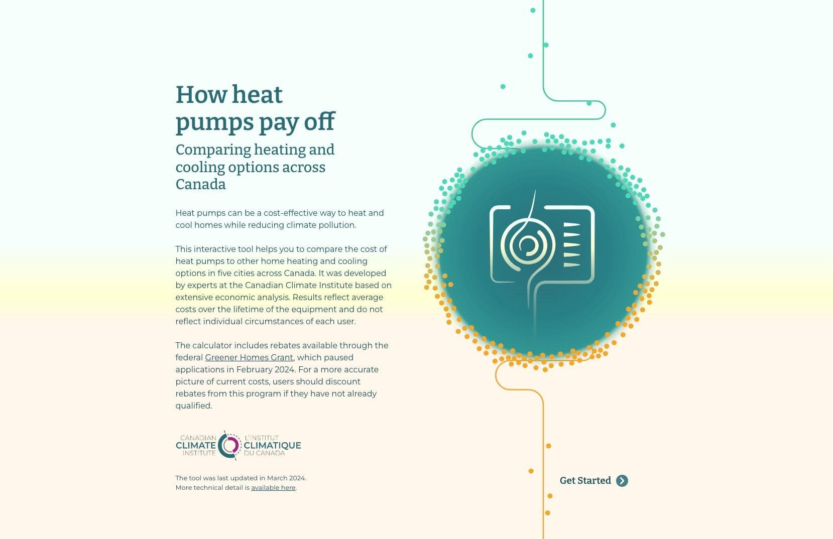
For the Canadian Climate Institute, my team at Voilà: Information Design crafted an interactive web tool to boost heat pump adoption. This micro-site needed to present heating and cooling costs for different configurations across five Canadian cities, four building types, and three build years.
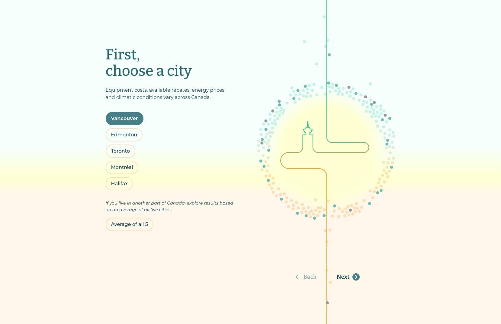
To keep readers engaged, we designed a quiz-like experience with playful elements. Instead of presenting the numbers all at once, the site presents choices one at a time. First, the reader chooses a city, a building type, then an approximate build year.
Collaborating closely with Joey Cherdarchuk, I worked on the concept, information design and dataviz, and the development of the micro-site in SvelteKit. Marie-Blanche Rossi was behind the visual design and illustrations, and Francis Gagnon provided design feedback.
Read more about the details of this project here, and check out the project here.